
How to Run the Applications
How to Run the Applications 관련

Finally, it's time to get familiar with mini applications (you can see an animated demonstration of the TUI applications here ()).
Browsing Through the Data
The esru_browser is a simple browser that lets you navigate through the raw race data.
esru_browser
The application shows all the race details for every Runner in a table that allows sorting by column.
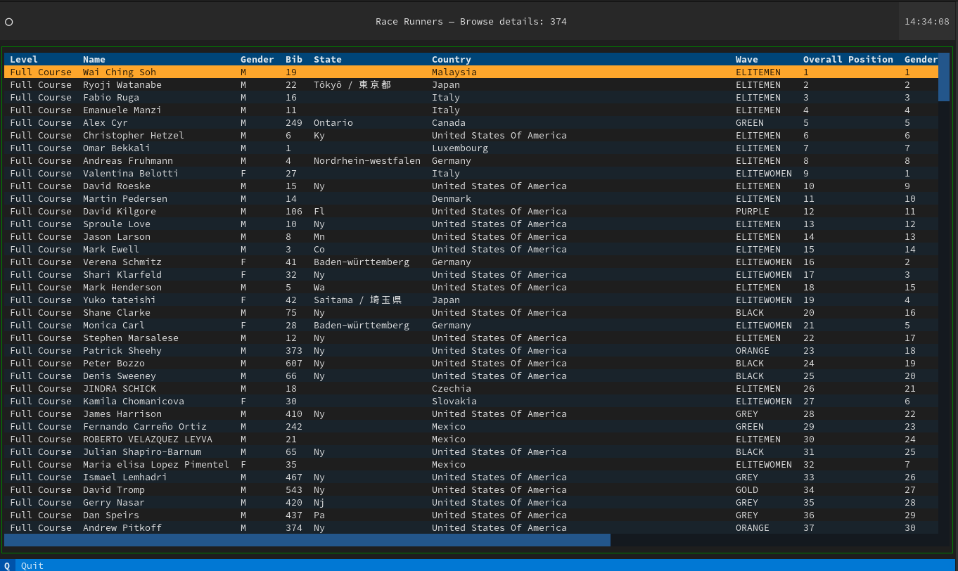
The esru_browser window shows all runners' results. Here you can sort, search for runners, and click to get more details
And the command palette allows searching for runners by name (it's basically a search bar with fuzzy logic):

race_runners_2023-12-31T18_35_53_558956.svg, searching for runners by nameSummary Reports
To get insights about racer behavior, you need some summary reports (as opposed to drilling down into each racer's details).
This application provides details about the following:
- Count, standard deviation, mean, min, max 45%, 50%, and 75% for age, time, and pace
- Group and count distribution for Age, Wave, and Gender
esru_numbers
Some interesting facts about the race:
- The average age was 41 years old, and 40 years old was the largest age group.
- The majority number of people belonged to the 'BLACK WAVE'.
- The majority of the people finished the race in between 20 and 30 minutes.
- The youngest runner was 11 years old, and the oldest was 78.

esru_numbers gives a bird's eye view of all the racers, categorized by bucketsFinding Outliers
This application uses the Z-score to find the outliers for several metrics for this race:
esru_outlier

the
esru_outlier main screen shows you racers that did not follow regular patternsBecause these results drill down to the BIB number, you can click on a row and get more details about a runner:

And you can get details for each outlier. Yes, code is reusable and is the same to show details for any runner
Textual has excellent support for rendering Markdown as well as programming languages. Take a look at the code to see for yourself.
A Few Plot Graphics For You
The esru_plot (josevnz/tutorials) application offers a few plot graphics to help you visualize the data. Inside, the class Plotter does all the heavy lifting
Age plots
The program can generate two flavors for the same data, one is a Box diagram:
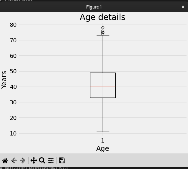
The age box diagram we saw before
The second is a regular histogram:
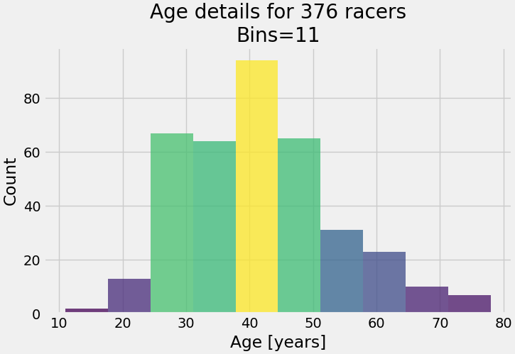
Age histogram shows the same as the box diagram but the buckets are more visible. Same data, many ways to explain the racer demographics.
You can see from both graphics that the group age with the most participants is the 40-45-year-old bracket and the outliers are in the 10-20 and 70-80 year old groups.
Participants per country plot
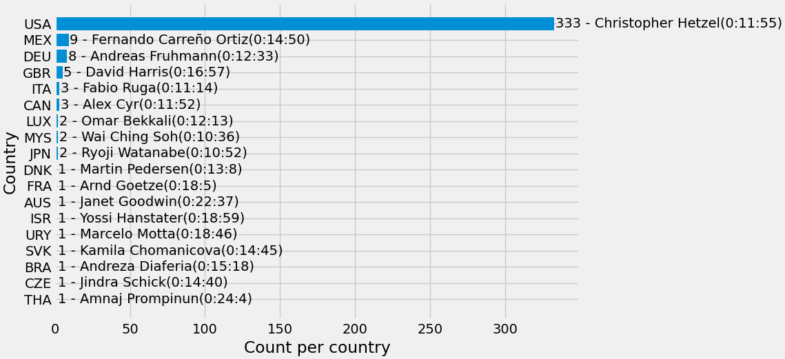
This plot shows all the countries with the number of participants, with the best runner from each.
No surprises here: the overwhelming majority of racers come from the United States, followed by Mexico. Interestingly, the winner of the 2023 race is from Malaysia, with only 2 runners participating.
Gender distribution
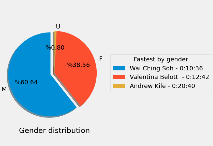
The gender distribution pie showing the best racer for each category
The majority of the runners identified themselves as Males, followed by Females.